Horse Racing Part 2
In a nutshell
The horse racing racecard. For anyone who’s not a fan of racing, it’s hard to underestimate its importance to the betting experience, whether offline at a meet or, here, online. It brings the runners and riders to life for punters - and it’s worth over £1 billion in turnover for William Hill racing.
Every horse racing site features a racecard though. So our challenge was to make the William Hill racecard a key differentiator - a one-stop-shop for users to explore and validate their choices, make it easy to place bets while being able to use independent data for relevance (unlike other sites).
Project Goals:
- Be the first racing product to provide independent data from two sources; Racing Post and Timeform. This should increase bets placed per active based on previous data and analysis.
- Fix a number of legacy issues on alternate markets; forecast/tricast, match bets etc. This will increase turnover on these markets.
- We have seen that streamed events on all sports increases turnover, therefore, the signposting and labelling for streaming events should be clearly labelled.
- Integrate multiple promotions and concessions for the user to opt-in to or be made aware.
Round 1 - The Lab
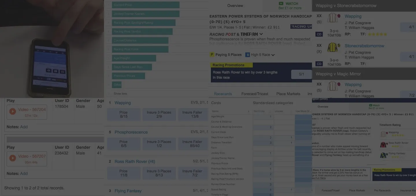
This project actually started with a mobile prototype because we had a slot in our user testing lab coming up. In a change to our normal design process, we started with building our best guess. Because of the complexity of the prototype, I built out a functional racecard in HTML/CSS using the Foundation for Sites framework.
The Product Owner had a strong view on how things should work, a clone of Racing Post, so I built out Prototype and tried out the more traditional view in an alternative prototype.
Testing Outcomes
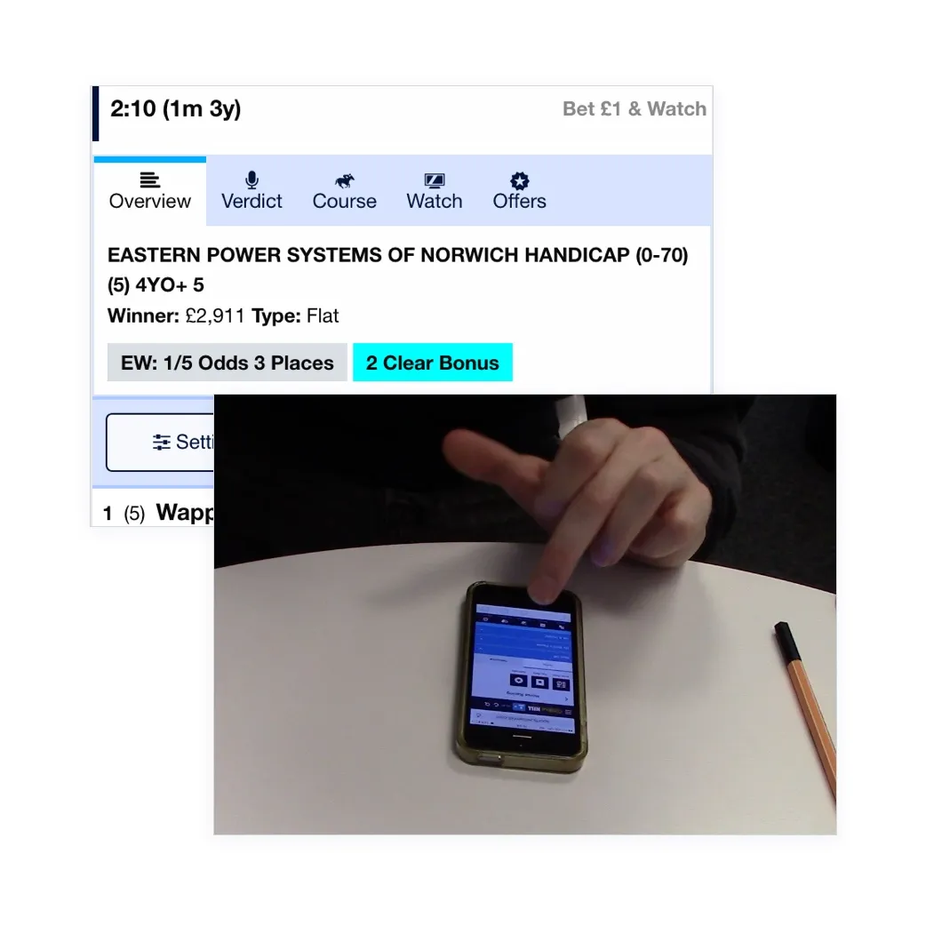
I organised and moderated the two-day session in our London office with candidates that met our criteria. Acting as the moderator I was able to see first hand how they interacted with the product.
Results: Prototype 2 was the unanimous outcome as users found it more familiar. The product owner took this on board for the next stages along with the other feedback.
I would use this for all my racing betting if you tidied it up, there is a bit too much data
~ First Round Candidate - 20 years betting on Horse Racing
- 16
- Iterations
- 70
- Users Tested
- 7
- Breakpoints
- 4
- Iterations
Get User Input Early
Getting early feedback from users on initial concepts made starting the design process a lot easier. Putting out two different ideas gave us a wide range of open feedback to work from. With such a clear winner and solid justification in the initial test, I had a solid backbone to start iterating through further concepts.
Key outputs from the testing were:
- Users preferred a layout that was familiar with what they were used to, particularly if they had accounts with other bookmakers
- Their research on what horses they would select was made offsite. All quoted using Racing Post, but further data on the cards helped them support their choices.
- The user found value on the depth of information we presented but hoped the end product would be less cluttered and more balanced.
Digging The Data
Before I started to work on the second rounds of designs I did some further research on what data regular horse racing users used to make their selections.
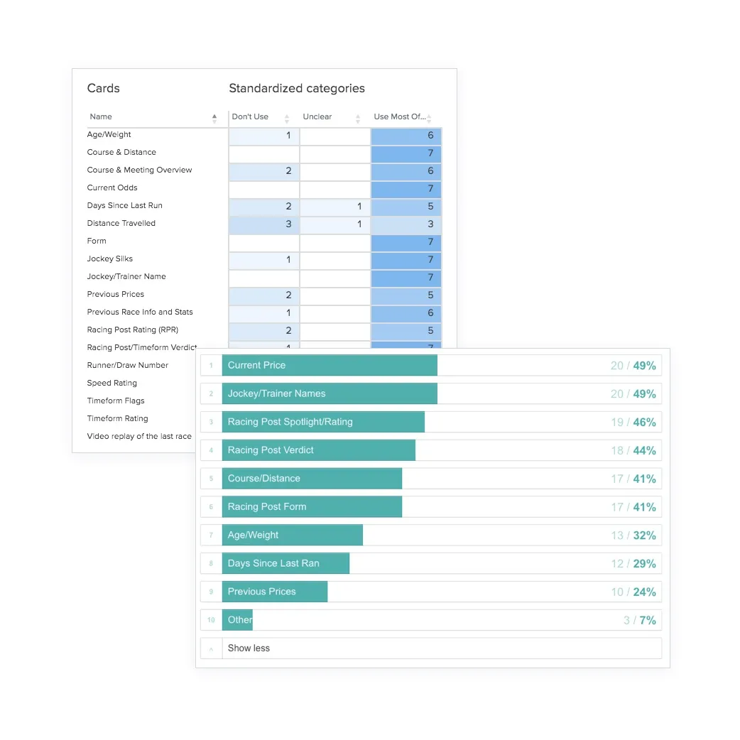
Card Sort: A Optimal Sort card sort was sent out to 17 internal staff who bet on horse racing regularly. The purpose was to find out what specific information they use to guide their selections.
User Survey: We sent an inbox questionnaire to 100 of our existing customers to ask what information they looked for as well about their knowledge Timeform, the new data source we planned to introduce.
By using this information we were able to prioritise the information that was most important to customers. We were also able to remove data that would have just cluttered the interface.
Prototyping & Usability Testing
After thorough user testing and initial sketching, I went straight into Axure to start building the wireframes. The key issue was to include a comprehensive amount of live data into a small space
I remember reading this great story on how they built Twitter Video to get playing with the product in their hands was key to getting a great product.
Using Axshare I could quickly try interactions on my device and send it out to remote usability testings for feedback or to stakeholders for review.
Below are some of the screens, iterations and ideas for the main and sub cards that we trialled.
Desktop didn’t work
The focus was mobile first, as 80% of our business is now on mobile. When we scaled the designs up to desktop it failed, badly. Some reasons for this were:
- There was more content in the surrounding frames that confused the users.
- The media player on the right-hand column conflicted with the media content we were highlighted in the main area.
- Controls, such as “show more” were in the wrong location when scaled up to a larger real estate. Desktop users are still high value in our racing product so I persevered and created four further rounds of iterations and testing to reach a design that was more usable for our users.
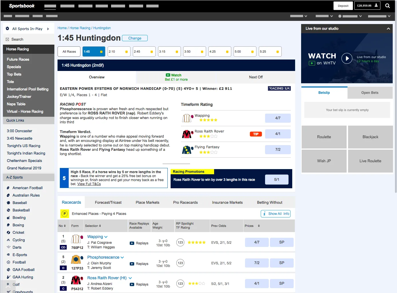
The Final Design
After rigorous testing, the final output delivered key improvements whilst retaining a structure that was familiar to customers.
- Tabs were used to separate the race information and streaming. This UI pattern allowed for more race level features to be added in future.
- The branding and instruction were given clarity and space to stand out.
- The promotional content was clearly grouped and scaled if fewer offers were shown.
- The structure of each selection was retained from the old card but information was rearranged, based on the research, to make better use of the available space.
What did I learn from this project?
Testing is critical
This was such a critical page for the business, taking on average £3 million a day, and that the experience had to balance usage between novice and expert customers.
Face to Face Testing is a skill
This project involved my first time moderating an in-person user research session. It was massively beneficial to be in front of users at an early stage but to be consistent, impartial and ask explorative questions is a tricky skill to master.
Don’t go with the first idea
Getting a few ideas out in front of customers BEFORE starting the design process was a different way to iterating on a concept. We took a couple of ideas and came out with a mash-up of a baseline to begin from.
Mobile & Desktop are different experiences
Scaling up a mobile design to desktop doesn’t work. More content on the page reduces readability and users behave in a different manner.
This project was still in the development phase when I left the company. However, the rigorous testing with a wide spectrum of users gives me confidence that this will gain William Hill more wallet share from the avid horse racing customer and meet the goals of our initial workshop.
The project is now live and the majority of the work from from both of my case studies has been implimented. You can test it out for yourself and see what you think if you fancy a flutter.